Case studies
Full write-ups for each project. These open in an interactive viewer when JavaScript is enabled.
OKX Earn
Senior Product Designer · Yield discovery, subscribe / redeem, portfolio
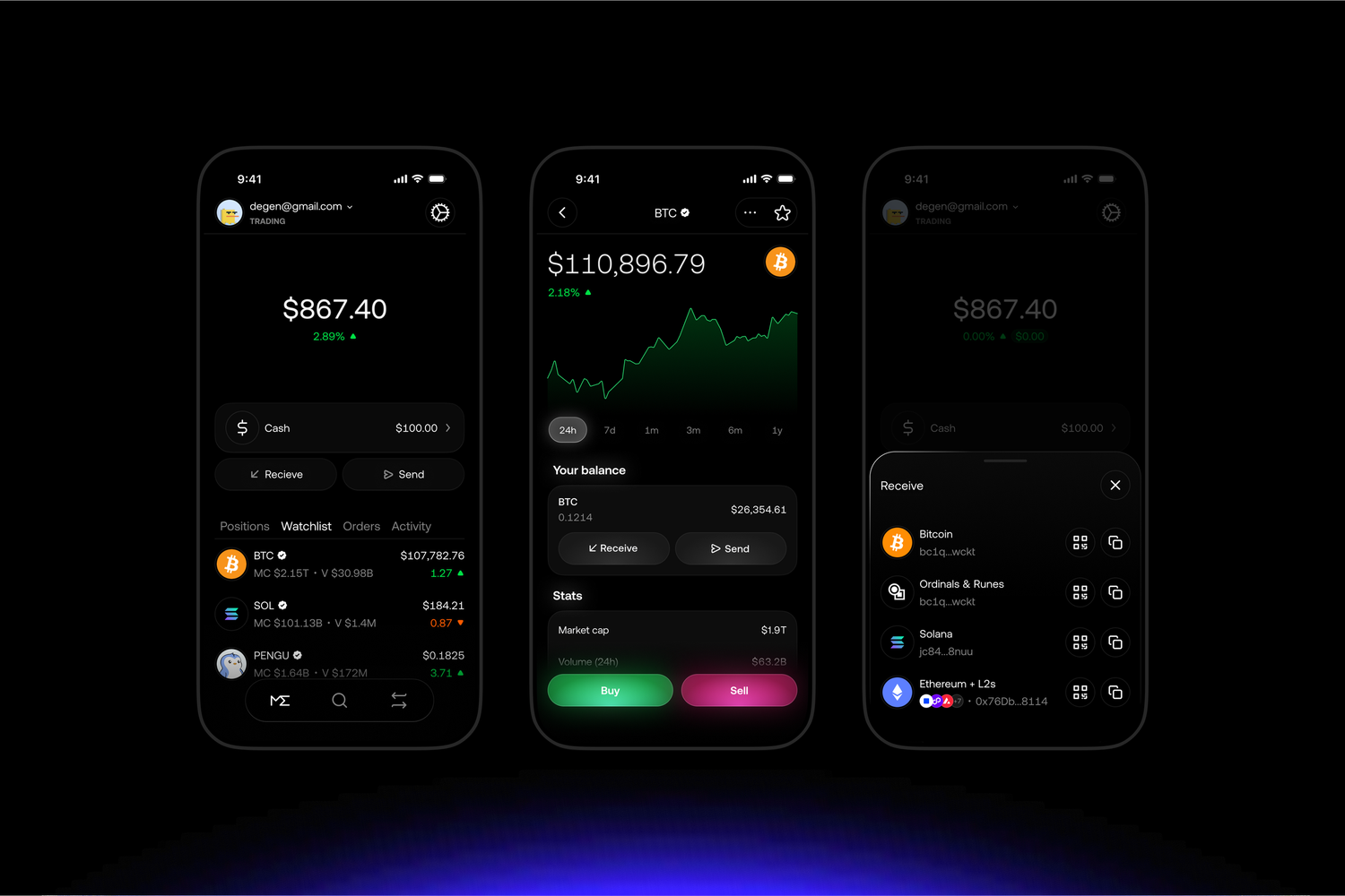
Earn is the unified home for staking, savings, structured products, and on-chain yield at OKX. These screens cover the portfolio view, liquid staking, the redemption flow, market APY history, and stablecoin yield onboarding.
Magic Eden Mobile 2.0
Lead Product Designer · Discovery, wallet, trading
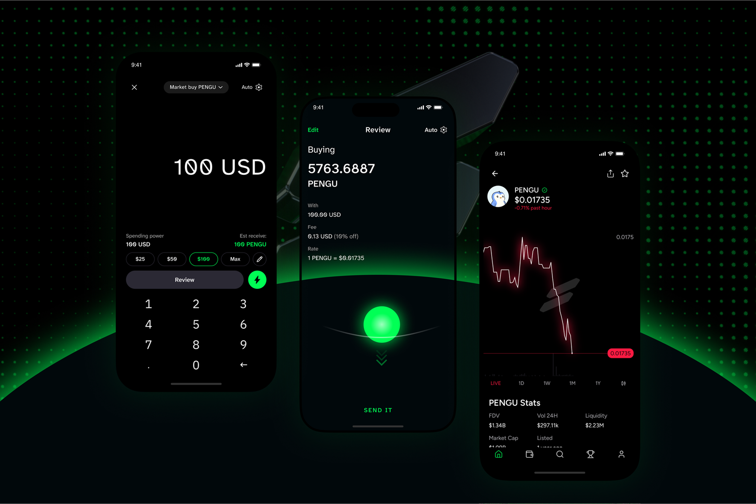
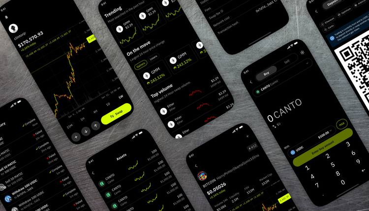
Magic Eden Mobile 2.0 is a complete redesign of the mobile trading experience, built to bridge the gap between mainstream usability and advanced crypto trading. The new app introduces embedded wallets, USDC abstraction, and powerful trading tools like limit orders, recurring buys, and real-time PnL tracking—all within a seamless, high-performance interface.
View on the App Store
Slingshot App
Sole Designer · End-to-end launch & ongoing maintenance
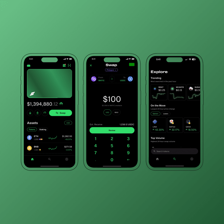
These are the latest designs of the Slingshot App prior to its acquisition by Magic Eden, where I played a key role in the overall design efforts. Major updates included USDC abstraction, an interactive trade pullback animation, a new leaderboard, referral rewards, and a complete Discover section overhaul.
View on the App Store
Chainlink Explorer
Product Designer · Oracle data explorer
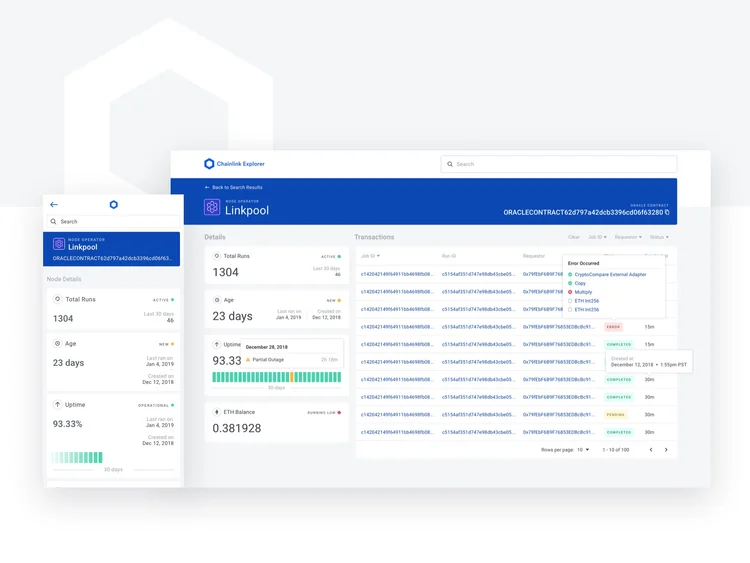
An on-chain oracle explorer that made Chainlink data feeds legible to non-engineers across the ecosystem.
Read the design requirements documentation
NFT Perp Exchange
Product Designer · Perpetual futures for NFTs
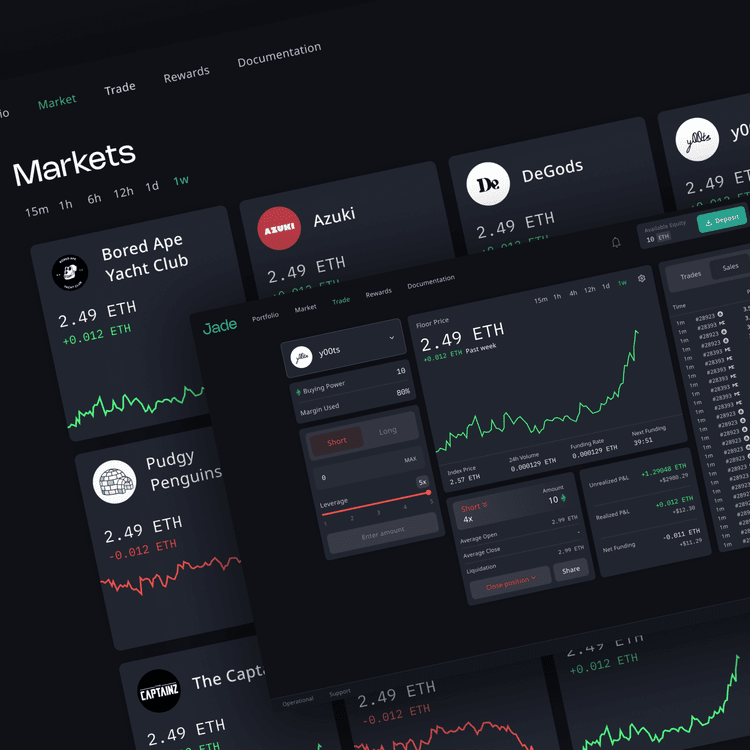
A futures market that allows you to invest in NFTs without owning NFTs. Bet long or short on the market with perpetual contracts.
Markets — a high level view of all available markets to trade from.
Portfolio — view overall account performance including open positions and buying power.
Rewards — users earn from a pool shared between all traders, incentivizing platform usage.
Trading — the perp market view with recent NFT sales across all NFT exchanges.
Facebook Employee Help Intake
Product Designer · Case routing & deflection
Background
Cases are meant to document employee HR requests and interactions over time and, eventually, make it easier for team members to resolve complicated HR related issues Facebook employees face. Today, cases serve as a means of capturing the request and interactions but system and process limitations are preventing scaling a case management system for all Facebook employees.
A new case intake experience is to improve the current internal help support to make it more user centric, personalized, and guided.
Problem
Today, the case management will not scale as-is. The process is handled over email and is very manual. Lack of transparency into the process for the employee leads to redundant and, oftentimes, needless cases being created. The inability to track cases at the right level of detail also leads to the need for manual triage and prevents the ability to tie related cases together, requiring all cases to be handled independently. In addition to these inefficiencies, the email channel also creates compliance risk as there is no way to ensure that employees are taking the proper steps to secure sensitive information in a compliant manner.
What does success look like?
QUANTITATIVE
- Deflection — success rate for deflection between 40-50% of questions that come from Intake Form
- Decrease time to resolution (better user experience and increased agent capacity)
QUALITATIVE
- Decrease duration for employees to solve their issues
- Eliminate employee frustration in the time it takes to receive an answer
- Deflect employees from submitting a case by surfacing relevant information from people portal content without the need of an agent
Hypothesis
- By routing users to a central location where they can submit and view their open cases, this will eliminate the lack of transparency and reduce redundancy.
- By surfacing relevant FAQs from a few user selections before they submit a case, not only do we provide employees with a better experience by providing quick answers to general questions, but we reduce the amount of unnecessary created cases.
Design Overview
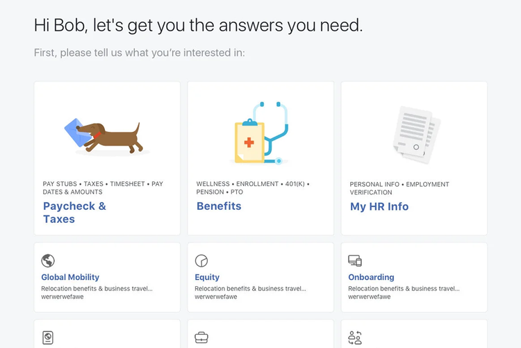
Auto Reply Email — notifies employees that emailing peeps@ or other aliases will not open a case, and guides them to submit through the help center on the People Portal site.
Case Type Selection — the first page of the intake experience. Gathers high level data from the employee selection so we can suggest relevant answers or content.
Program Selection — narrows down the employee's search so we can give the most relevant information before they reach the case submission form.
Results Page (Deflection) — shows relevant FAQs and vendor contact information which could solve the issue before opening a case, reducing unnecessary cases.
Case Submission — opens a case and captures required information from the employee in order to address their issue.
Apple Product Requirements App
Sole Designer · End-to-end lifecycle · 5 engineers, 1 PM, 1 PjM
Project Details
Team
- I was the sole designer and led design for the entire lifecycle of the product.
- Worked with 5 engineers, 1 product manager, and 1 project manager.
Process
- 2-week sprints
- Daily standups
- Agile work environment
Timeline
- Shipped MVP in 4 months
- Rolled out over 15+ feature enhancements after launch
Background
The development process of a product begins with the business requirements but as a company grows, so does the pains of misalignment and miscommunication. The task is to solve for this gap in the process.
User Research
By interviewing 8-10 various business and engineer users for 30mins each, I was able to gather some common insights. Some of the takeaways include:
- No single source of truth for project requirements
- Too little visibility, too much latency
- Lacking formal review and approval process
- Hard to track the conversation against the user stories as business and devs use different tools to write and track requirements.
Business and technical constraints
Although I practice mobile first design, this product will strictly be used on desktop due to required VPN enabled and the complexity of the platform.
The biggest challenge was that business needed flexibility to work in an iterative environment as engineers needed stricter handoff of requirements that doesn't change so easily so there's alignment throughout the production process.
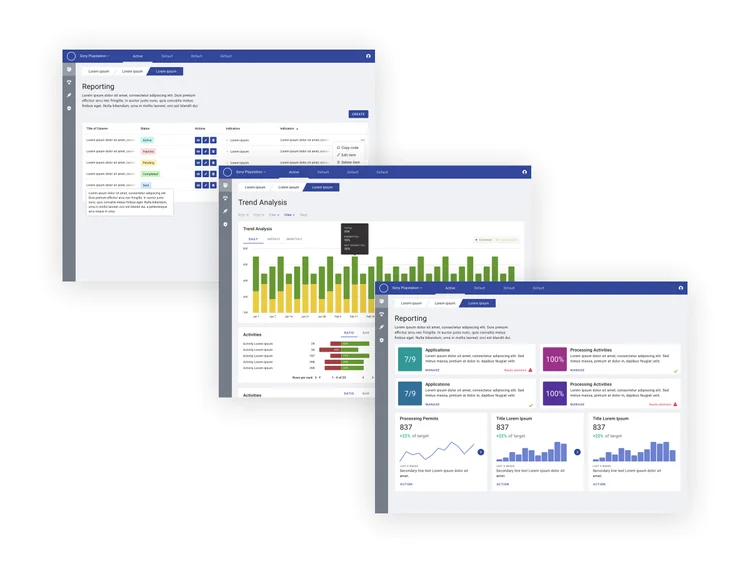
Existing Problem — all the different methods that teams use to handoff and track requirements suffer from lack of traceability during and after projects. This negatively impacts quality and the efficiency to iterate or fix development bugs.
Defining what we need to solve this
By creating a tool that enforces business and developers to easily create, track, converse, and report on project requirements, the development process will be more efficient and less prone to miscommunication. 4 main functions that we believed would solve this are:
- A place a user can create and edit requirements
- A place a user can make iterations of the document — version control
- Rope developers earlier in the requirement creation process to align functionality and limitations
- A conversation functionality to encourage a central place to communicate between teams
User Story 1: Requirement Creation
As a business owner, I want to create and edit requirements easily so that I can communicate and report them with stakeholders.
Wireframes and Requirement Editor
Creating a new Document — click-through prototype.
Creating a Requirement — click-through prototype.
- 3 panel independent scrolling
- Card components for grouping requirements
- Easy side navigation that scroll anchors the card in focus
- Dynamic right panel meta data and action items per in-focus requirement
Challenges and Discoveries
I truncated each requirement card to make it easier for users to scan through the document, but little did I know that users actually found it a lot easier to see everything at once even though the document would get lengthy. This is because users are used to editing apps such as Word, Quip, or Pages. Click once to edit makes editing any part of the document quick and accessible.
User Story 2: Version Control and Approvals
As a business owner, I want to easily iterate on a requirements document so that I can make necessary changes before handing off for development.
As a developer, I want to track all the requirement changes so that I can make sure products are built with the utmost quality and efficiency.
Solidifying requirements with collaboration — giving business the freedom to iterate on the document, with an approval process to enforce sign off before development begins.
- Detailed outline of working and published versions
- Preview and exporting to various files
- Clear approval status of the published version and each approver
- Details of required dates and authors
Challenges and Discoveries
The approval process was a tricky feature to design for, as there are many moving parts associated with the interactions from both sides of the process, the requester and approver. I initially combined version control with approvals to make the task use fewer interactions, however this diminished the experience by not allowing users to create and export multiple versions without an approval process.
User Story 3: Action Items
As a business owner or developer, I want to reduce latency by effective communication so that I can deliver with the least amount of time possible saving resources and stress.
- Number alert for quick glance unresolved action items
- Action item filtering of assigner or published version
- Quick preview and click to target
- Single level reply for organized conversations
- Clear labels and icons to differentiate resolved and unresolved items
Building out Acceptance Criteria
For a complex product like this, I outlined the acceptance criteria for each requirement and user story. Acceptance criteria are conditions that a software product must satisfy to be accepted by a user, customer, or consuming system. I used Gherkin syntax to write expressive scenarios for each user story.
Mapping the experience — 4 main pillars: Activity (document details, versioning, action items), Summary (supporting documents), Requirements (themes, requirements, user stories), and Read (a flat readable view for approving versions).
What did success look like for MVP launch?
Adoption
- Teams throughout the company started requesting to use the application
- Gave over 50+ demos to various teams and stakeholders
- Created over 10+ reusable keynote slides
- On-boarded over 1,000+ employees to MVP, actively using and growing
Efficiency
- Teams reported saving sprint cycles due to the application, which is hundreds of hours per sprint
- More bugs were fixed in less time due to stronger communication and alignment on requirements
Feature Enhancements
Notifications
Notifications allow users to be informed about activity in the document that's relevant to them in real time. This is key when a project is time sensitive and stakeholders are waiting on an action that needs to be taken by the assignee.
Assigning Action Items
Assigning people to an action item allows for direct notifications, helping grab attention from a specific contributor. This reduces latency and focuses the user's attention on what's required on their behalf.
Landing Page
I explored several iterations of the landing page with the same feature benefits, floating image and call to action — all above the fold (600-700px). Goals were a high conversion rate and getting users to create their first document, with enough value proposition to motivate them and a single call to action to make getting started simple.
Salesforce.com
Product Designer · Pricing, navigation, guided tours
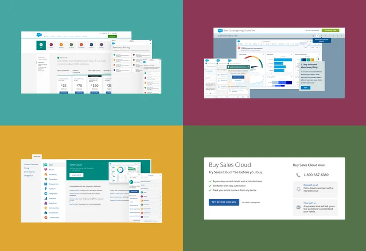
Salesforce Pricing
Salesforce does not have a pricing overview page from the navigation, except it defaults to the Sales Cloud pricing page, pricing for a single product. We need a solution that lands users on an overview page that gives an intuitive way to route to the right pricing page while briefly educating them on products we offer.
Salesforce Guided Tours
Guided tours are quick walkthroughs of CRM solutions that highlight Salesforce features from the product family such as Sales Cloud or Service Cloud.
Salesforce Navigation
Salesforce continued to acquire companies and add numerous products to their platform. It had become overwhelming for customers and prospects that want to explore Salesforce offerings especially for the first time. The navigation was cluttered and was very difficult for the user to find an existing product they use or learn about other offerings.
How to Buy Salesforce?
Salesforce is a very complex product that requires some effort to understand the differences between each product in the product family and how they're each configured to the needs of the customer. Furthermore, there isn't an obvious way to purchase Salesforce as you do on most e-commerce sites. The reason for this is the complexity and limitless solutions that Salesforce has to offer. This project shows how I solved this challenge by adding an experience without moving or iterating content on Salesforce.com.
Slingshot Flex App
Product Designer · Perps, order book, leverage flows
DeFi Dashboards
Product Designer · yAxis, PrePO, SkopeAI, LinkSwap
yAxis
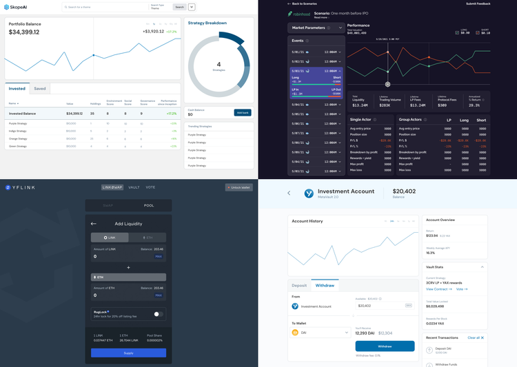
Staking Liquidity Pool Aggregator.
PrePO
Decentralized trading platform allowing anyone, anywhere to gain exposure to any pre-public asset.
SkopeAI
The world's first platform that lets investors easily create and trade their own AI-powered portfolios, with an interface facilitated by natural language processing (NLP).
LinkSwap
DeFi on Chainlink. Rebranded as Varen Finance.
Slingshot Wallet v1
Sole Designer · Non-custodial wallet
The original Slingshot non-custodial wallet — the foundation that scaled into the mobile app.
Visit the Slingshot website
Design System for GDPR Project
Product Designer · Consent & privacy components
Componentized consent and privacy surfaces for a multi-product GDPR rollout — one system, many products.
Options Trader App
Product Designer · Retail options trading
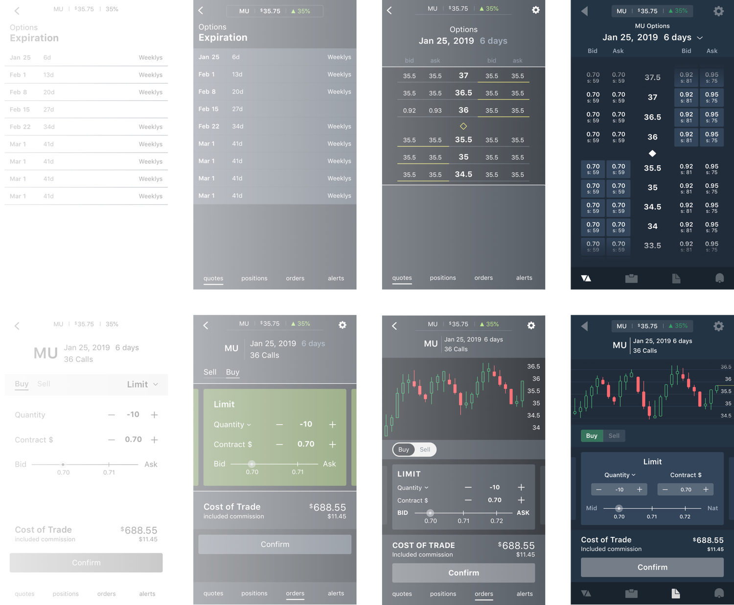
There are many trading platforms on both desktop and mobile and many of them didn't have great usability. Almost all of them are filled with a lot of unnecessary information that clutters the screen and makes choice demotivating for users. This can be frustrating even if you're a professional trader because features are never in the same place as another application.
I designed the entire experience and UI of an app that utilizes the right interactions to quickly interact with core functionalities. By executing orders faster, trades can be more accurate, giving the user more control.
What do users need in an options trading application?
- Speed. This is important because in options trading a small move can happen quickly and thus can affect profit margins significantly.
- Accuracy. It's important that users get accurate information because handling people's finances is always a sensitive task.
- Accessibility. Because financial interactions on mobile can be quite unforgiving, it is important to highlight necessary information through affordance to make usability obvious to all users.
Thinkorswim's mobile app opportunities
Thinkorswim has one of the best options trading mobile apps out there but still lacks attention to the user. Some opportunities I found:
- Too many taps to make an options trading order. Fewer taps to a task goal will increase the amount of completed tasks, potentially increasing total commissions and revenue.
- No visibility of the chart while the user is finalizing their order. This makes it harder for users to make accurate orders as there is nothing to monitor price action during their order process.
Timing is everything
I have grown to like trading options and got used to buying and selling from the Thinkorswim mobile app. Every second is money as a trader because missing your buy order by just a second can cost you huge profit opportunity. By using this app frequently, I noticed some difficulty in quickly finding certain actions and toggling features that users care about when placing an order.
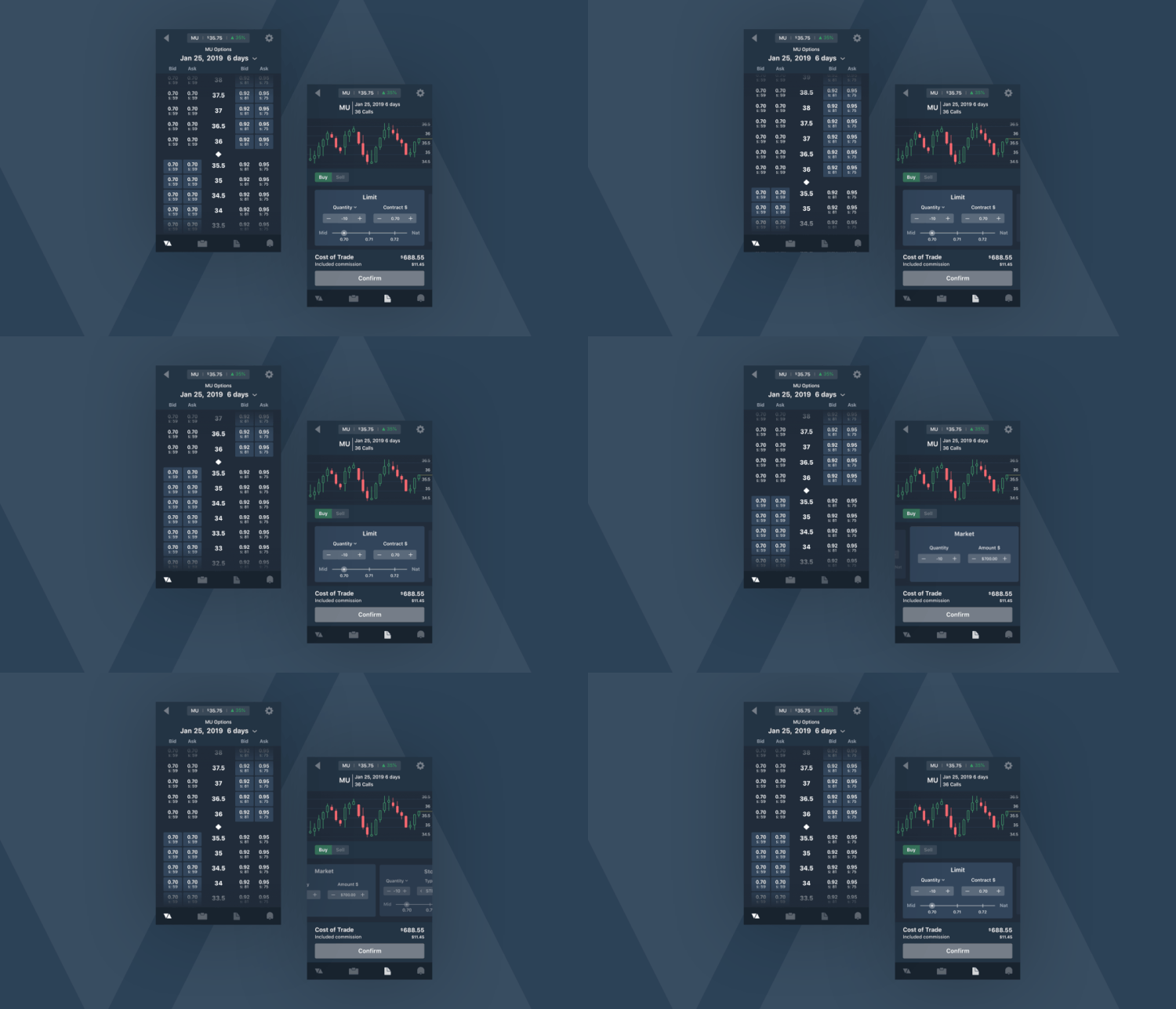
Iterations — first I wireframe without color to explore different ways to present the required information, focusing on the interactions that matter before enhancing the design visually.
Interactions
In this project I focused on 2 interactions that help users get to the options a lot quicker than dropdowns or accordions.
Vertical Scroll
I chose this over a conventional dropdown, because although a dropdown might allow more real estate for other information, I didn't want to complicate the experience. This allows users to focus on one task at a time, removing all distractions and allowing them to quickly make crucial decisions.
Horizontal Carousel
There are many different order types such as limit, market, stop and stop loss. Each of these will have toggles and adjustments specific to that order type. In order to give users all the functionality of each order type but also quickly switch between them, swiping between cards in a horizontal carousel makes a perfect interaction.
Iconography
Many trading apps disregard the importance and effectiveness of branding its UI. Even icons can give a company a unique brand identity. Here I went with a minimalistic and modern look and feel, as it makes a delightful experience and gives the perception of a capable trading app with cutting edge technology.
Cryptocurrency Exchange
Product Designer · Mobile-first exchange & wallet
The cryptocurrency industry is booming and with all the buzz out there, a lot of people are curious about how they can get in on the trading and investing opportunities.
The main problem is that the industry is still very new and a lot of entrepreneurs are rushing to build an unstable and unforgiving exchange for the sake of getting to the finish line first. They are also doing this without proper research and addressing core user needs.
Core tasks of a new user to cryptocurrency
- Buy and sell cryptocurrency
- Manage portfolio
- Transfer cryptocurrency
Mobile first design
- Mobile first approach as it is the easiest way to trade on the go and helps focus on core functionality.
- Build mobile components that can scale to desktop components.
- Start with a native application as trading and transferring will be easier and smoother.
Needs for new users
This application is designed for non-technical users who want to buy, sell and manage digital assets for the first time.
- Make it feel secure as they will be trusting their funds with the centralized system
- Always make users feel they have full support and no dead ends
- Show important information that's necessary for the user to understand the meaning behind sensitive interactions
- Notify users on changes to their account
- Least amount of taps or clicks to navigate to core functionalities
Opportunities and problems
- Could use more contemporary mobile gestures to make the interactions between screens effortless and delightful.
- Too many places to buy and sell a specific coin. Fewer places to do the same task encourages habit forming and makes it easier for users to get familiar with where all the elements are.
- Different screens have inconsistency in font weight. It's a lot more pleasing to the eye when typography is consistent throughout the product.
- Transaction history consists of both trading and transferring transactions, making it harder to find a specific line item.
Information Architecture — a site map of application features and hierarchy of content.
Solutions
- Distinctly separate buying from receiving and selling from sending, without causing too much friction to return to the other screens.
- Separate the trading and transferring history to make it easier for users to locate a specific transaction quicker.
- Utilize contemporary mobile gestures to create habit forming actions.
- Only use one location for one actionable task, which helps users remember on repeat use.
- Create a system of elements such as a typography hierarchy so there is consistency throughout the application.
Interaction Flow — the model of my application is simple, fluid, and solves the problem of today's crypto applications.
Primary User Tasks (MVP)
1. Buying
Given that I am a first time user, when I download the application and sign up, I want to buy bitcoin for the first time.
2. Adding Coins
Given that I am a user looking for a specific coin, when I open the application, I want to search and add a cryptocurrency.
3. Transferring
Given that I understand and own a separate digital wallet, when I buy a cryptocurrency, I want to transfer the coins to my separate wallet.
On-Boarding
On-boarding should support the primary tasks users go through, helping them fully understand the necessary steps so they create habits on repeat visits.
- With a few pre sign-up splash screens to introduce the benefits of the application, we reduce bounce.
- Giving users a choice to take a guided tour once inside helps new users learn the app without dismissing existing users — showing we care, and building a sense of trust.
Splash Screens
In-App Tour
High Fidelity Screens
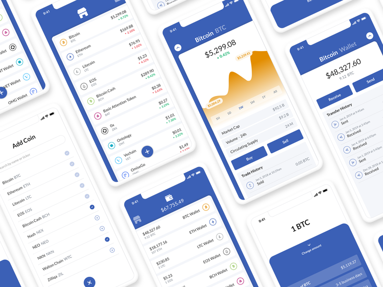
Market Prices and Wallet — swipe horizontally between market prices and your wallet; search and add coins to your watchlist.
Detailed Price and Detailed Wallet — open for charts and coin details, return to all prices or wallets at any screen, swipe across to see wallet details.
Trading and Payments — swipe up to review buy order, swipe down to change your order.
Search and Add Coins — add coins to watch from the market or wallet home screen, search by name or ticker, queue up as many added coins before closing.