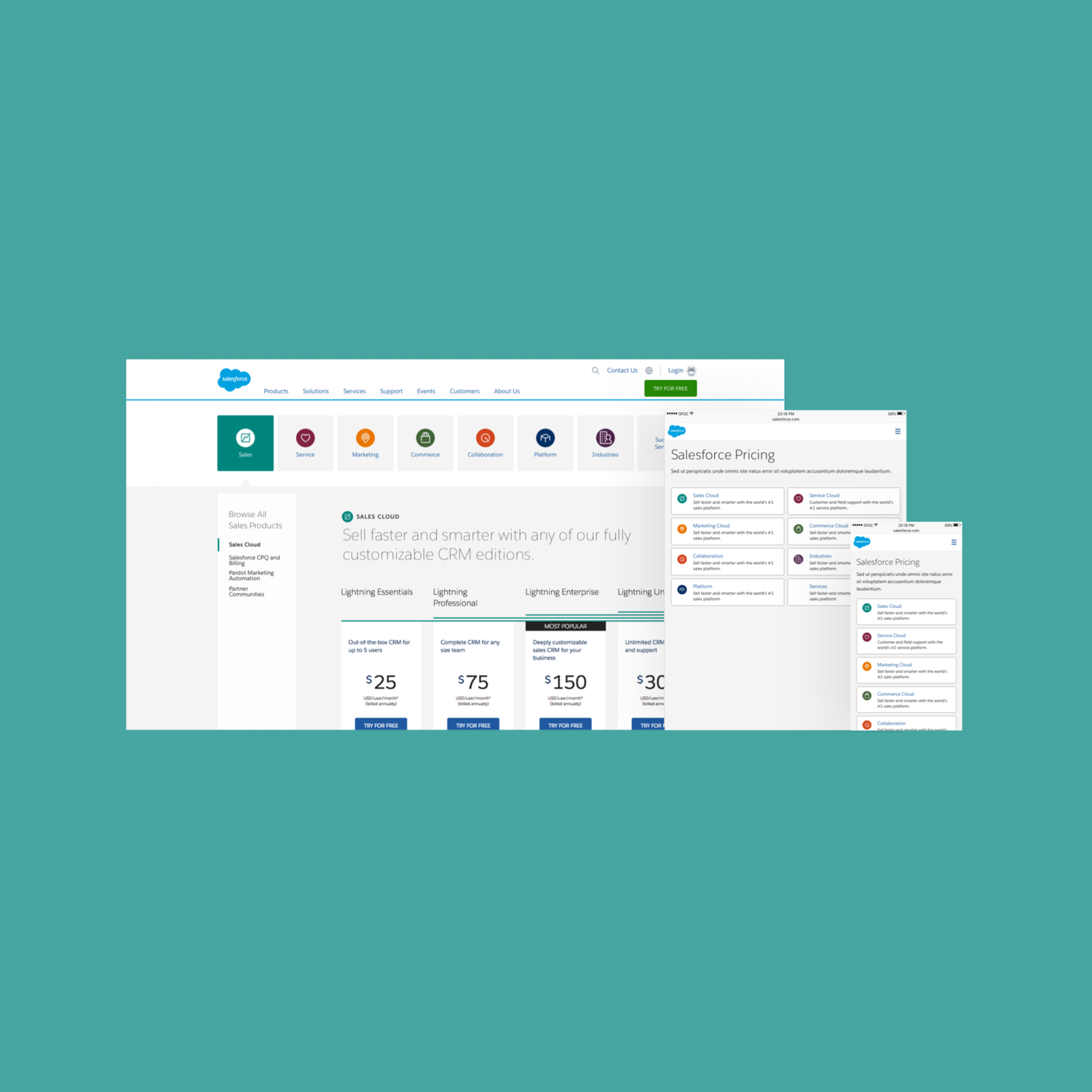
Salesforce Pricing - Full Case Study

Salesforce Pricing
Design Challenge
Salesforce does not have a pricing overview page from the navigation, except it defaults to the Sales Cloud pricing page, pricing for a single product. We need a solution that lands users on an overview page that gives an intuitive way to route to the right pricing page while briefly educating them on products we offer.
Results after implementing solution
+27% Increase in Form Views (quarterly)
+15% Form Completion (quarterly)
Requirements
Business Requirements
Core Cloud Products
Related Options
Edition Cards
Comparison Chart
Testimonials
User Requirements
Images of the product
To navigate and dive deeper into price details
A way to compare features with their price

Complexity to Conversion Ratio
Hypothesis: More pricing and product details are needed for a more conversion focused experience.
🔬 Research Driven Solutions from Test Insights
Simple design and less upfront information to route to product type
User Feedback:
Users prefer the hyper-simple design that funnels them to the correct section before being shown too much information.
Too much upfront information is cognitive overload.
Potential Solutions:
With the new proposed “Cloud Focused” IA, we can easily incorporate the simplicity of the hyper-simple concept while retaining a clear understanding of how those products fit in those groupings.
Tabs of Content Panels (Recommended)
Routing Cards
Left Navigation
Full comparison of pricing features to measure the value of each edition
User Feedback:
Less clicks to compare full pricing is what most users expect from this experience.
The comparison chart was very desirable by many of the participants and met their expectations.
Potential Solutions:
Comparison Chart
Show full pricing only
Hide and show content through interaction
User Feedback:
The content panel interaction was warmly welcomed by users and worked well with the content.
Potential Solutions:
Users found it easier to navigate by not leaving the page when interacting with menu items. Instead, with interactive grouping replacing pages, the user can easily explore options and reduce time to task.
Content Panels (Recommended)
Light Box
Tooltips
Upfront converting CTAs with supporting information.
User Feedback:
Participants found it helpful to be given the option to further continue their learning with demos and free trials.
Potential Solutions:
If there is enough upfront information, users are more inclined to want to further explore and learn with offers and trials.
CTA Button
Text Link
🖌️ Iterative Sketches and Wireframes


Solution
From our iterative testing results we saw that people did not mind a routing page before seeing pricing as it was quick, simple, and did not require any thought. This elevated the complexity of the pricing information and allows us to present tailored information which significantly helped prospects learn and find the pricing tier that was suitable for them.
Pricing Overview and Detail Pages


