Salesforce Mobile Guided Tour - Full Case Study

Salesforce Mobile Guided Tour
What are Salesforce guided tours?
Guided tours are quick walkthroughs of CRM solutions that highlight Salesforce features from the product family such as Sales Cloud or Service Cloud.
Discover — Why guided tours on mobile are important?
Currently, guided tours don’t exist on mobile site-wide and we are losing prospects from that channel. We found that users are interested in taking the guided tours on mobile as they click on the CTAs to guided tours on mobile.
Compared to desktop users, mobile device users can visit our site from a wider variety of environments and contexts, yet the variety of core offers (demo videos, guided tours and free trials) we have for mobile phone users is restricted.
As you can see below, the guided tour on mobile is broken:

Define — What does it mean to have offers on mobile?
We say we want to help you run your business on your phone, so shouldn’t you be able to take a guided tour on your phone?
Opportunity
Mobile offers will increase overall exposure and engagement
Offers will become more accessible, increasing traffic
Bridges the journey from desktop to mobile and vice versa
Make the perception of our products seem as responsive as our website. (if our website isn’t responsive, how does that look for our products?)
We Need New Mobile First Components
Components promote quality, consistent UX design across products; and expedite the work of designers, developers, and anyone else working on a website, application, or any digital design. ~ Nielson Norman Group
Scalable site wide reusability.
Site becomes more responsive.
Mobile first components makes us think simple / MVP
Not all mobile first components need to be built from scratch, we are inheriting some from Lightning.
Design — 1st Round of User Testing Results

We started sketching around our first use case which was for Sales Cloud since it has the most traffic. Once we successfully design the mobile solution for Sales Cloud guided tour, we will build for the rest of the guided tours.
Tour Selection
Initially, users did not recognize that they could press on a tile to start a tour.
Chapters
Users said the tour was “straightforward” and “concise”. They found the progress bar was helpful. Users liked seeing product images, though magnified portion too small & confusing. Many did not notice the tooltip & unsure how to exit full screen, still users said it was “helpful”, “good to have”, and a “cool feature”.
After the Tour & Next Steps
Users had a better understanding of Sales Cloud and its benefits. They were curious about taking another tour and preferred to continue learning more on their own.
Iteration from User Feedback


Breadcrumb component to just a title.
A new visual picker component that has more clickable affordance.
A new button with icon component that is more prominent.
Replaced the pagination with the lightning component process indicator.
Improved visibility on close icon for full screen lightbox.
Add pinch-to-zoom functionality on full screen lightbox.
Add alerts from lightning component library.
Change background image so it doesn’t clash with copy making it more readable.
All next step CTAs and links brought above the fold for more visibility without the need for scrolling.

Design — 2nd Round of User Testing Results
Past usability issues FIXED
Users engaged with the fullscreen tooltip quickly and was easy to use
Navigating through the tour was intuitive
Though some thought the tour was a solutions finder
New insights
Tried swiping up to reveal additional text/copy.
Users typically only read the headline and then jumped to the image.
Some image differences were too subtle and confused users.
Particularly during the first few steps of the tour (1–4).
Overall, the tour was “clean and was very easy to understand”.
Users “loved” seeing product images.
CTAs at the end of the tour aligned with expectations.
Users either took another tour or view pricing.
Some were unsure where the “Take Another Tour” link might lead
Iteration from User Feedback

Final Solution
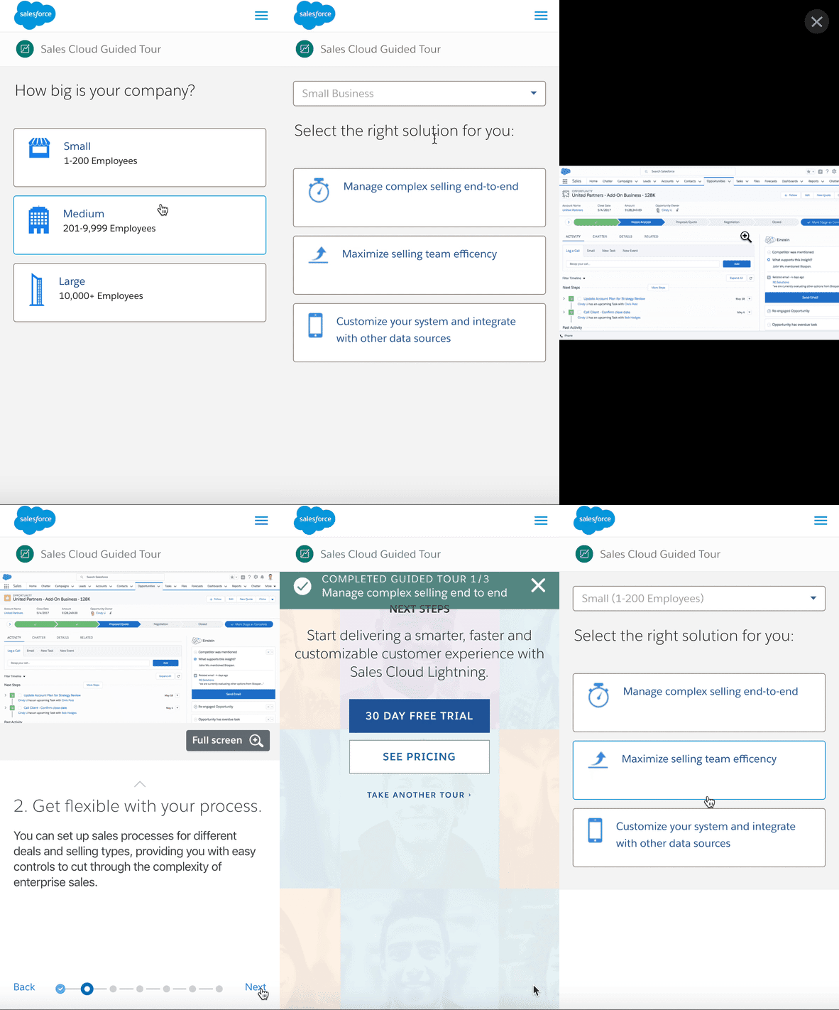
After refining the product with a few minor iterations from user testing, these are the high fidelity mockups of the shipped application.

Conclusion
Mobile components and features are helpful to user’s that utilize space efficiently, improving the responsive experience. Clarified paths removes confusion and reduces complexity. Users cannot take a free trial on mobile, which means currently users are only converting on demo videos. Building more core offers available on mobile will help funnel mobile user’s down the funnel.
