Salesforce.com Navigation - Full Case Study

Global Navigation
The Challenge
Salesforce continued to acquire companies and add numerous products to their platform. It had became overwhelming for customers and prospects that want to explore Salesforce offerings especially for the first time. The navigation was cluttered and was very difficult for the user to find an existing products they use or learn about other offerings.
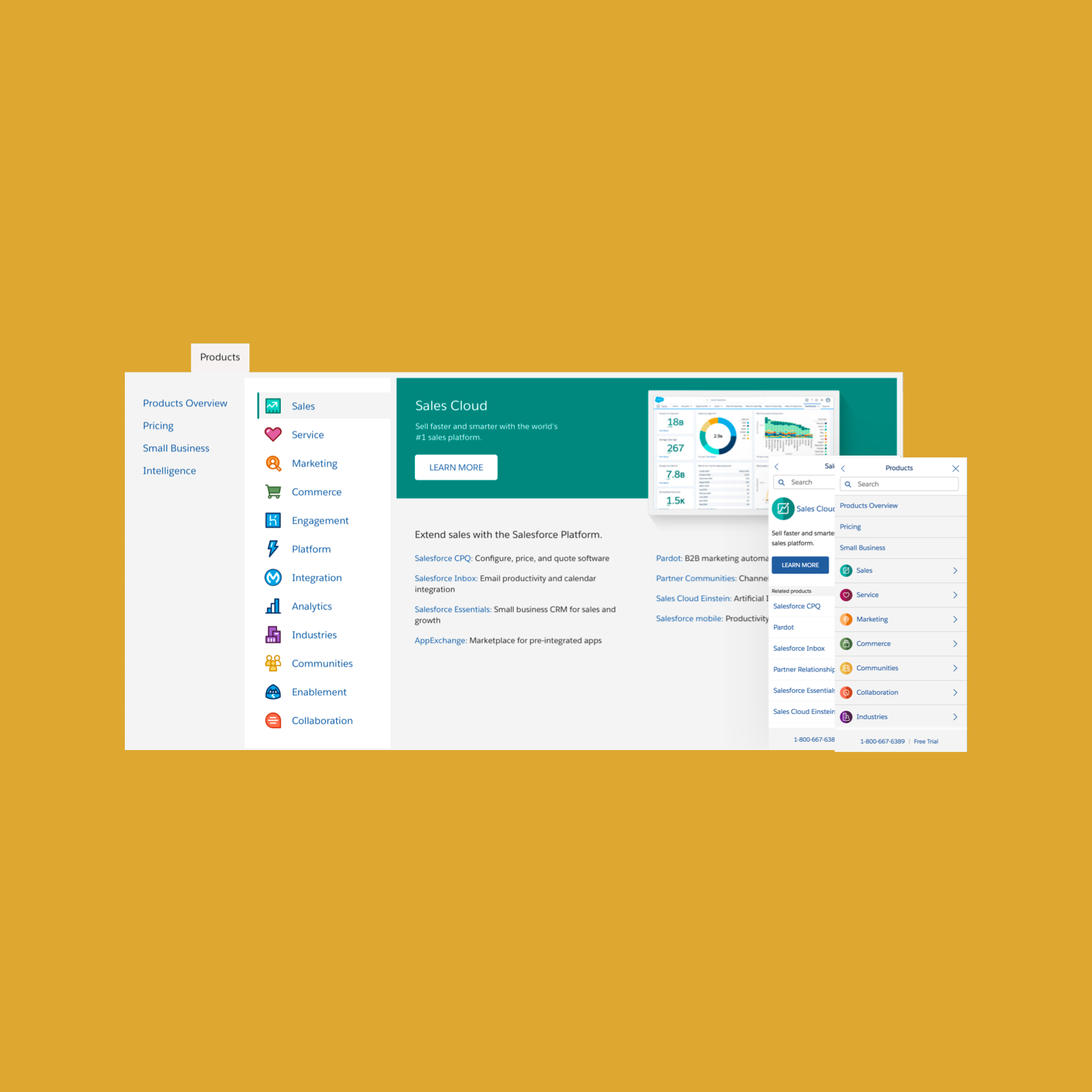
I led the user experience to create a solution that removed complexity by grouping products and services of the same family.

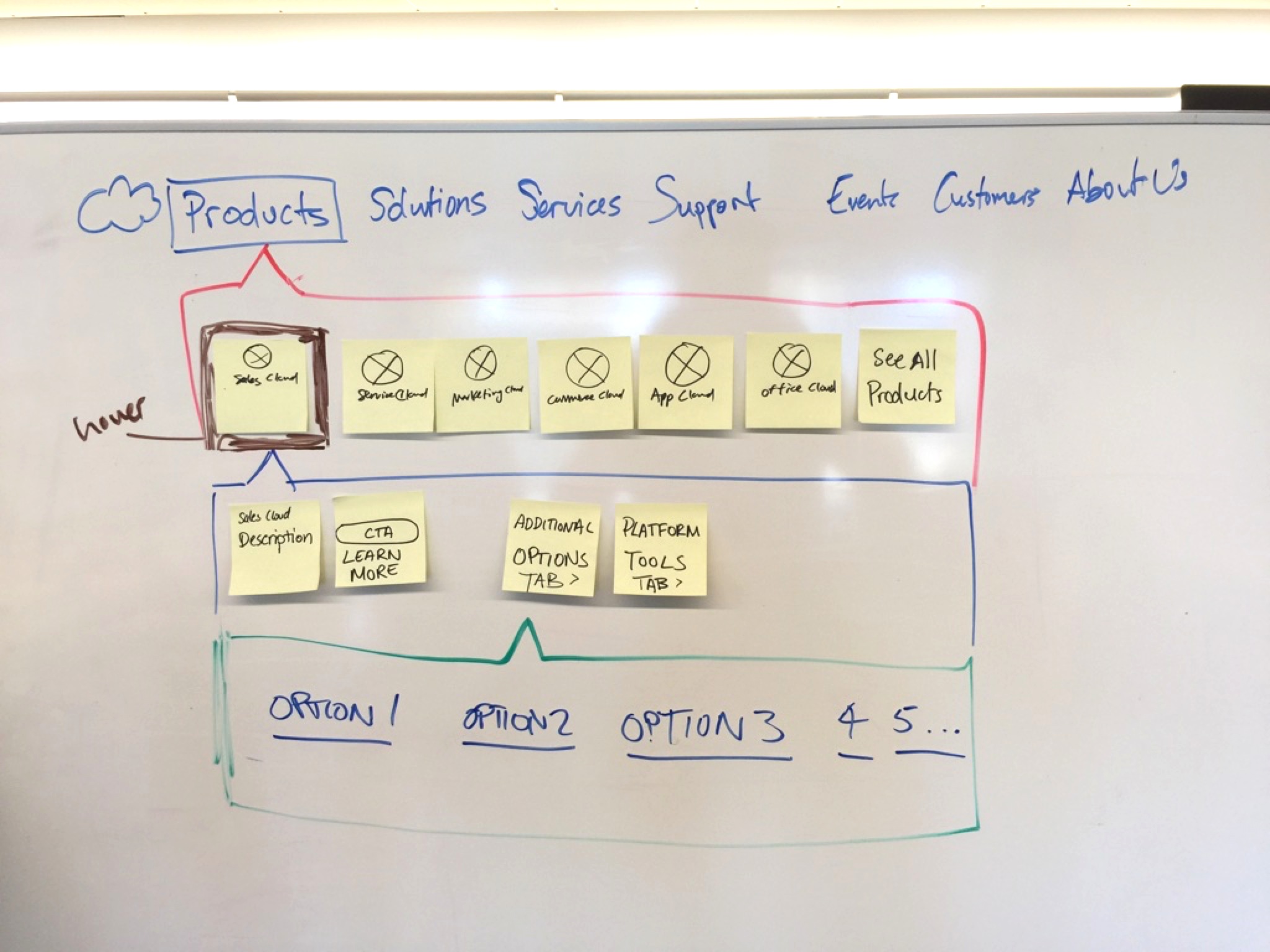
Information Architecture
In any website the most crucial part is the information architecture and how user’s navigate through it. I helped conduct a strategic information architecture white-boarding session that helped frame where everything should be positioned. The companies core values and KPIs helped drive the UI and interaction decisions.
Design Documentation
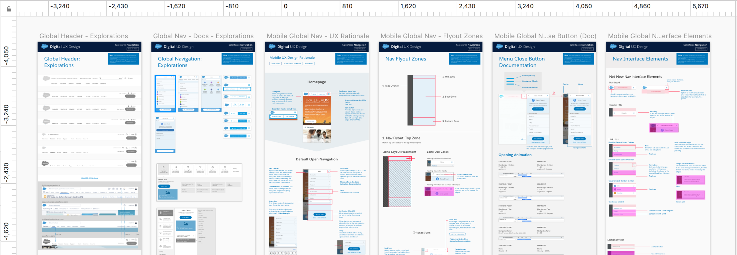
It’s important to handoff different documentation types for different stakeholders as they Explorations
We threw out all the different possible iterations on how the mobile and desktop navigation could looks like that matches our business goals.
Rationale
Our org was fairly large with many different stakeholders that had a share in the impactful change to the website. Therefore, once we decided on a solid solution it was important to state the rationale of our approach in order to “sell” our design. Since not all stakeholders understood user centered design, it was our responsibility to educate them so they could make better decisions.
Zones
Setting recommendations on where components should be placed are also important, especially for the Web Producers. This will be key for them when they assemble all the elements to create these pages. An obvious but much needed example of this is that the global header should always live at the top of the page as it is the most important component in order to navigate through the website.
UI Elements
We try not to introduce new elements and use solely from our design system. However, if the solution is limited by the components we have available, we’ll state our case and document the new component to be added to the system.
High Fidelity Mockups
After finalizing the user experience and interface, we handed off the documentation to the visual designers to make final touch ups and export redlines.

