Options Trader App

Options Trading Application
There are many trading platforms on both desktop and mobile and many of them didn't have great usability. Almost all of them are filled with a lot of unnecessary information that clutters the screen and makes choice demotivating for users. This can be frustrating even if you’re a professional trader because features are always never in the same place as another application to begin with.
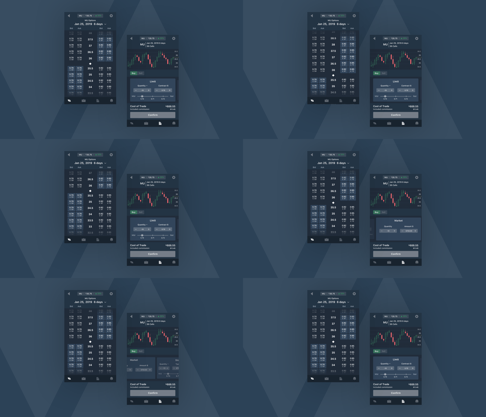
I designed the entire experience and UI of an app that utilizes the right interactions to quickly interact with core functionalities to executing orders, trades can be more accurate giving the user more control.
What do users need in an options trading application?
Speed. This is important because in options trading a small move can happen quickly and thus can effect profit margins significantly.
Accuracy. It’s important that user’s get accurate information because handling people’s finances is always a sensitive task.
Accessibility. Because financial interactions on mobile can be quite unforgiving due to the nature of the platform, it is important to highlight necessary information through affordance to make usability obvious to all users.
Thinkorswim’s mobile App Opportunities
Thinkorswim has one of the best options trading mobile apps out there but still lacks attention to the user. Some opportunities I found in the Thinkorswim app are:
Too many taps to make an options trading order.
Fewer taps to a task goal will increase the amount of completed tasks, potentially increasing total commissions for the company and in turn increase revenue.
Less interactions will also make user think less giving it a more desirable time to completion.
No visibility of the chart while the user is finalizing their order.
This makes it harder for users to make accurate orders as there is nothing to monitor price action during their order process.
Timing is everything
I have grown to like trading options and got used to buying and selling from the Thinkorswim mobile app. It is a lot quicker to choose your options contract and place limit orders. Every second is money as a trader because missing your buy order by just a second can cost you huge profit opportunity. By using this app frequently, I noticed some difficulty in quickly finding certain actions and toggling features that users care about when placing an order.

Iterations
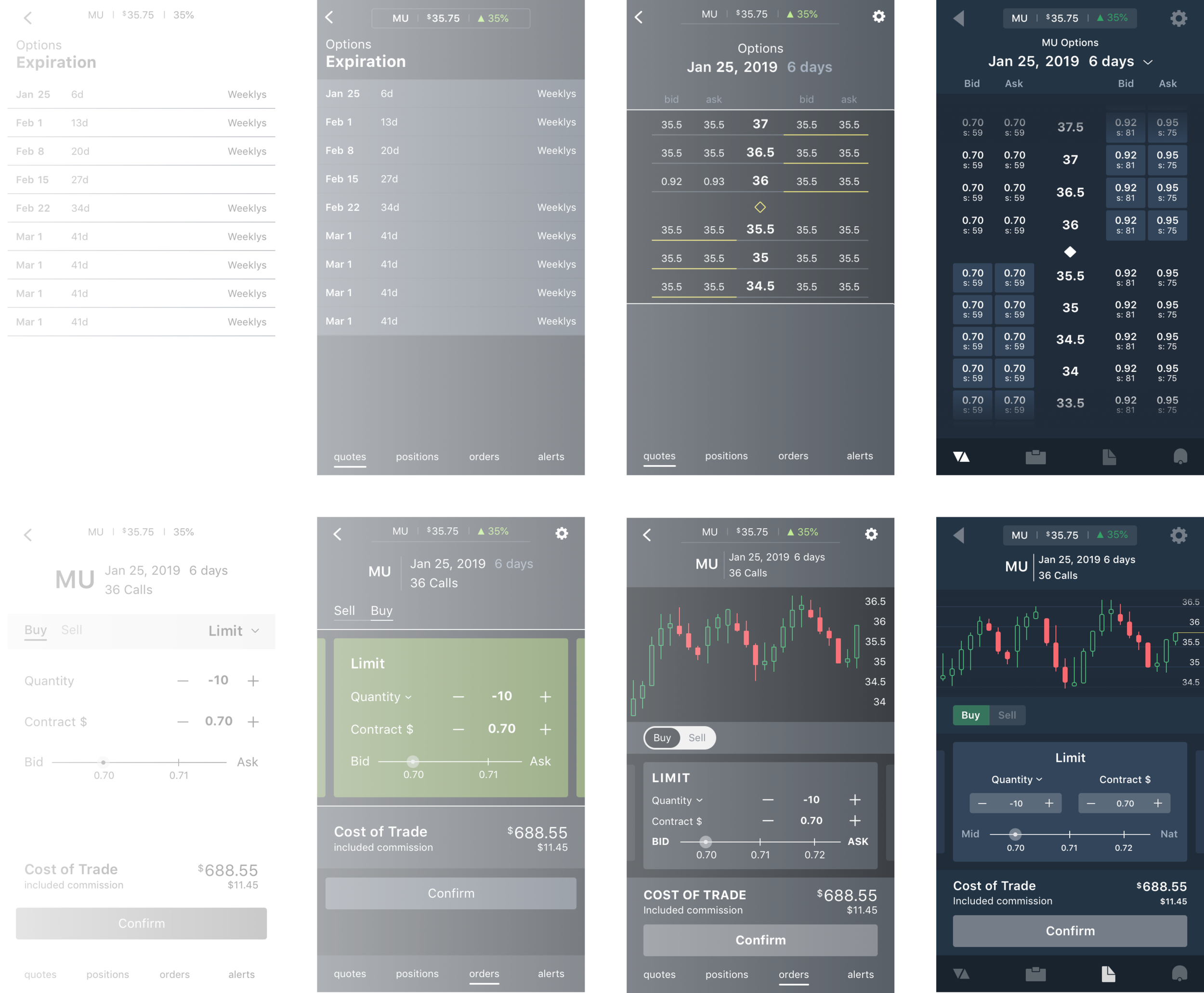
First I wireframe without color to explore different ways to present the required information. This helps me focus on the interactions that matter when building out an experience of any particular screen before enhancing the design visually.
Interactions
In this project I focused on 2 interactions that I believe will help users get to the options a lot quicker than dropdowns or accordions.
Vertical Scroll
I chose this over a conventional dropdown, because although a dropdown might allow more real estate for other information, I didn’t want to complex the experience but allow the user’s to focus on one task at a time, removing all distractions and allowing them to quickly make crucial decisions.
Horizontal Carousel
There are many different order types such as limit, market, stop and stop loss. Each of these will have toggles and adjustments that are specific to that order type. In order to give the users all the functionalities of each order type but also quickly switch between them, swiping between cards in a horizontal carousel makes a perfect interaction that does just that.
Iconography

Many trading apps disregard the importance and effectiveness of branding it’s UI. Even icons can give a company a unique brand identity. Here I went with a minimalistic, and modern look and feel, as it makes a delightful experience and gives the perception of a capable trading app with cutting edge technology.
